Still Life – Final Images

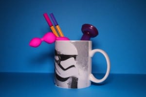
IMG_3228 final

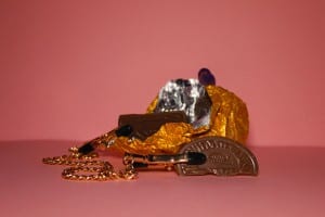
IMG_3222 final

IMG_3208 final

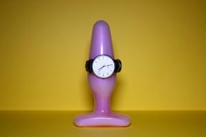
 Like I said in my research, I wanted to create a set of 3 images in the style of some of Stephanie Gonot’s work with the use of contrasting items and background colours.

I shot against coloured card with the only light being a high powered LED panel with a pink gel filter. Aimed head on at the items to make sure the they were clearly defined and stood out. In terms of post-editing I did very little as my original images looked how I wanted them to. I fiddled about with the vibrance slightly but that was it.

Kit used:

Canon 600D

Canon 18mm – 55mm lens

Neewer CN-160 LED panel + pink gel filter

Manfrotto MKC3-H01 tripod


Still Life Research – Stephanie Gonot

Stephanie Gonot is a Los Angeles based photographer who specialises in still life photography. She’s works freelance and has provided images for big companies such as Adidas and Vice Magazine.  Her images demonstrate the use of bold coloured items against similarly bold and usually patterned backgrounds.

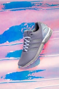
Part of a four image set she was commissioned to do for Adidas. The images unfortunately weren't used by the company.   'Adidas ZX Flux'
Part of a four image set she was commissioned to do for Adidas. The images unfortunately weren’t used by the company.
‘Adidas ZX Flux’
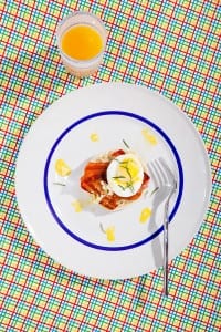
Part of a 6 image set for Vice Magazine.  '5-Course Microwave'
Part of a 6 image set for Vice Magazine.
‘5-Course Microwave’

I think her choice of imagery is striking. each of the items used within her images are so clear and vivid with there usually being a nice blend of matching and contrasting colours. A lot of her work also combines peculiar items together to add to the matching/contrasting look that she creates. The shadows of the items are there but they’re ever so subtle that it doesn’t take anything away from the overall image.

From her 8 image set 'Insult Cakes'
From her 8 image set ‘Insult Cakes’
From her 6 image set 'Fad Diets'
From her 6 image set ‘Fad Diets’

I’m going to mimic her style of bringing together unassociated objects and using clashing colours within the background and subject items as it makes for interesting viewing and is open to interpretation and, if done right, can look stunning.


Stephanie’s Website: http://www.stephaniegonot.com/

Stephanie’s Flickr: https://www.flickr.com/photos/gomargot/

There’s a lot more interesting and experimental imagery on her Flickr, but I’ve taken the images used in this from her professional website.

Appropriation – Final Images

For my first two images I wanted to imitate Peejet’s appropriation images by photoshopping myself and others into well known images. I really liked the humour he portrayed in his images so I wanted mimic that. The first one, a still from Stormzy’s music video ‘Shut Up’, has mine and two friend’s faces in the background. This image could have been done better if I had taken photo’s of mine and my friend’s faces instead of cutting them from pre-existing photos.

final 1st image

The second image is a still from a famous scene in Pulp Fiction. I like this image a lot more than my first as it looks a lot more realistic and the image of me that I photoshopped in is better quality as I took it for the purpose of the appropriated image.

pulpfiction3 copy

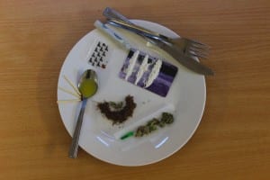
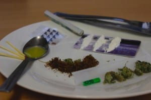
My third image is it the style of Salvador Dali. I really liked how he’d take random items, put them together and give them some sort of new meaning. I wanted to photograph a piece like his Lobster Telephone but to have some form of meaning to it. I came up with this idea whilst hungover and though ‘what if I put a load of drugs on a plate and photograph it?’* and it came out looking pretty cool. I set it out like a gourmet meal with the intention of it meaning that, to a drug addict, their fix is more important than food.
final 2final 1

*only the small amount of weed is actually real, I don’t sniff coke or take smack
 

Appropriation Research – Salvador Dali: Lobster Telephone

lobster-telephone-1938
Lobster Telephone, 1936

Created in 1936, Dali wanted to create a surreal piece using two items that were not normally associated with each other. Dali always associated Lobsters and Telephones in a sexual way, especially Lobsters and various other types of seafood, which he used in his 1939 live art installation, where models were dressed in seafood and there genitalia covered with lobsters.

dali
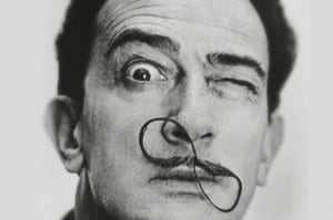
Salvador Dali. from everything I’ve read about him and all the images of him it just seems that he was a complete mad man, but his art was fantastic so I guess it balances itself out.

This piece is really interesting and I love the fact that it’s just a man made sculpture that’s been photographed, unlike the majority of appropriation images I’ve looked at, that have all been created using photoshop. The way he placed two of the most random items together is intriguing as it means nothing to anyone apart from him. I’d like to try and create something in the style of Dali but give my image some form of meaning that isn’t as surreal as the Lobster Telephone.