Home research – Jesse Burke

Over the space of 5 years Jesses Burke went on several road trips with his daughter and photographed their journey and her experiences with nature for his series ‘Wild & Precious’. He states on his website:

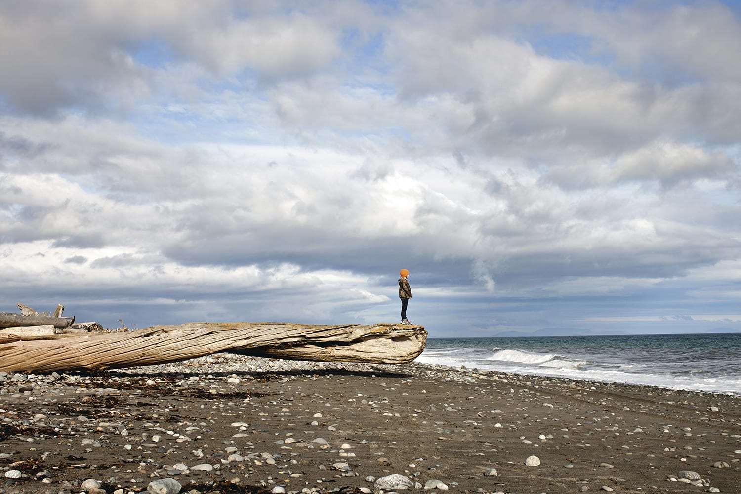
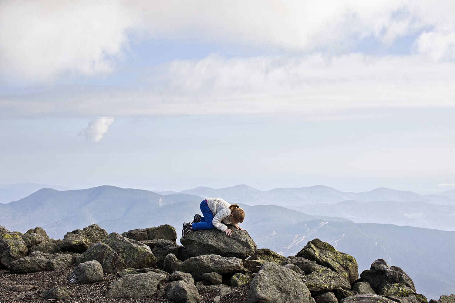
‘Wild & Precious brings together treasures from a series of road trips traveled with my daughter to explore the natural world. I use these adventures to encourage a connection between my child and nature and to give her an education that I consider essential—one that develops appreciation, respect, conservation, and self-confidence. On the road we talk about the vastness of nature and try to get more in touch with the earth. Together we document the routes we drive, the landscapes we discover, the creatures we encounter, even the roadside motels where we sleep. Wild & Precious reveals the fragile, complicated relationship that humans share with nature and attempts to strengthen those bonds.’

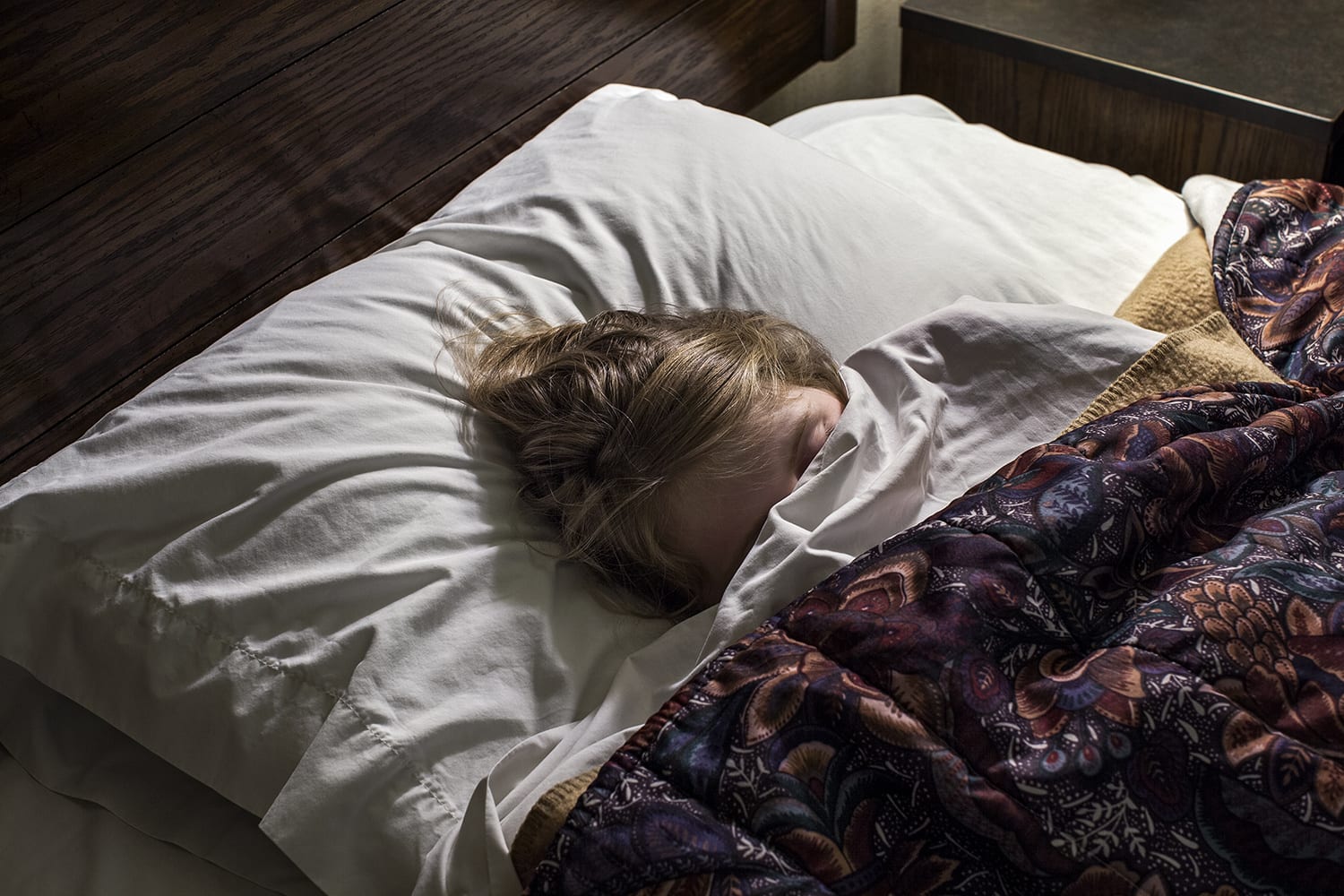
A lot of his images from their road trips are so striking with such crisp and harrowing back drops and his young daughter, exploring and learning, being swallowed up by the vast landscapes in which she’s surrounded by. It’s a beautiful insight into the relationship between Father, Daughter and nature, demonstrated throughout the 134 images in the series. It’s also interesting to see his daughter grow as she explores and climbs, yet how she returns to her childhood innocence through his images of her sleeping in the various cheap motels they stayed in on their journeys.

jesse burke 1

jesse burke 3

My favourite image from the series. The setting is incredible and should be the main focus of the image, but your eye is drawn to this small figure hunched over inspecting something on the pile of rocks she has ventured on to.

jesse burke 4


He also created what can only be described as one of the most beautiful short films I’ve ever seen, adding to the documentation of their journey and showcasing his love for his daughter and for her to experience everything the natural world has to offer.


I really like the idea of creating a series for the home brief in a similar way in which Jesse Burke created ‘Wild & Precious’ in the sense that I’d like to document over the course of 7-10 days what home means to me by photographing a rare week back in Nottingham with my family.


Jesse Burke‘s main website: http://www.jesseburke.com/welcome

Section about the series on his website about the series, in which the quote I’ve used came from: http://www.jesseburke.com/wildandprecious

Vice interview with Jesse about the series: http://www.vice.com/en_uk/read/striking-tender-photos-of-a-father-daughter-road-trip

Website in which you can find the film if the link I’ve put in doesn’t work properly: http://www.wildandprecious.co/film

A large portion of the series can be found here: http://www.wildandprecious.co/photographs

Portraiture – Final Images


A person I know:  The lighting on Joe's face makes his features stand out and makes the image very crisp.
A person I know:
The lighting on Joe’s face makes his features stand out and makes the image very crisp. This is my favourite of the 3 images.


Someone I don't know: It's not the most incredible image but I really like the guy in the photo, he's got crazy hair, odd looking eyes and multi coloured braces. I wish I'd photographed him against a more interesting background though.
Someone I don’t know:
It’s not the most incredible image but I really like the guy in the photo, he’s got crazy hair, odd looking eyes and multi coloured braces. I wish I’d photographed him against a more interesting background though.


Self portrait:  The head on lighting really enhances my facial features and makes my teeth stand out. I wanted to do something a bit different for my self portrait which I think I've achieved.
Self portrait:
The head on lighting really enhances my facial features and makes my teeth stand out. I wanted to do something a bit different for my self portrait which I think I’ve achieved.

Still Life – Final Images

IMG_3228 final

IMG_3222 final

IMG_3208 final

 Like I said in my research, I wanted to create a set of 3 images in the style of some of Stephanie Gonot’s work with the use of contrasting items and background colours.

I shot against coloured card with the only light being a high powered LED panel with a pink gel filter. Aimed head on at the items to make sure the they were clearly defined and stood out. In terms of post-editing I did very little as my original images looked how I wanted them to. I fiddled about with the vibrance slightly but that was it.

Kit used:

Canon 600D

Canon 18mm – 55mm lens

Neewer CN-160 LED panel + pink gel filter

Manfrotto MKC3-H01 tripod


Still Life Research – Stephanie Gonot

Stephanie Gonot is a Los Angeles based photographer who specialises in still life photography. She’s works freelance and has provided images for big companies such as Adidas and Vice Magazine.  Her images demonstrate the use of bold coloured items against similarly bold and usually patterned backgrounds.

Part of a four image set she was commissioned to do for Adidas. The images unfortunately weren't used by the company.   'Adidas ZX Flux'
Part of a four image set she was commissioned to do for Adidas. The images unfortunately weren’t used by the company.
‘Adidas ZX Flux’
Part of a 6 image set for Vice Magazine.  '5-Course Microwave'
Part of a 6 image set for Vice Magazine.
‘5-Course Microwave’

I think her choice of imagery is striking. each of the items used within her images are so clear and vivid with there usually being a nice blend of matching and contrasting colours. A lot of her work also combines peculiar items together to add to the matching/contrasting look that she creates. The shadows of the items are there but they’re ever so subtle that it doesn’t take anything away from the overall image.

From her 8 image set 'Insult Cakes'
From her 8 image set ‘Insult Cakes’
From her 6 image set 'Fad Diets'
From her 6 image set ‘Fad Diets’

I’m going to mimic her style of bringing together unassociated objects and using clashing colours within the background and subject items as it makes for interesting viewing and is open to interpretation and, if done right, can look stunning.


Stephanie’s Website: http://www.stephaniegonot.com/

Stephanie’s Flickr: https://www.flickr.com/photos/gomargot/

There’s a lot more interesting and experimental imagery on her Flickr, but I’ve taken the images used in this from her professional website.